Building a Customizable Messaging Platform
Jan 08, 2024
11 min read
Communication is an important part of human life. It helps resolve issues quickly, get answers to our questions and simply exchange ideas.
In the wise words of Stephen Hawking, “For millions of years mankind lived just like the animals. Then something happened which unleashed the power of our imagination. We learned to talk…“
Adding a chat experience in an app to get quick help goes a long way towards providing a great customer experience. This article is about designing and building the messaging platform SDKs (Software Development Kits) for Android to support adding a chat feature in PayPal and its tenant apps (e.g., Venmo, Xoom).
Importance of User Centricity
When designing a messaging experience for PayPal, we wanted to go with a user- centric approach, which means putting users first, anticipating their needs, and designing products based on that. So, the first things we needed to determine were:
- Who are our users?
- What do they want?
- How easy is it for them to use the platform?
- How can we make it customizable so that users can easily mold this into what they like?
Each user has unique needs. Some might want to customize the default chat UI and go with a completely fresh look with custom themes, brand icons, and images, while some others might want to go with the default look and a different data source. The platform SDKs should be able to support all of these. It’s sort of like selling donuts. They’re all made from the same dough, but some customers might like glazed while others may like chocolate or maple.

What Led Us Here
First, a little bit about the current messaging experiences in PayPal. Currently we have messaging with the PayPal bot, which helps customers with generic and account specific questions. We also have agent messaging where a user can talk to a customer support agent. When building the messaging platform, we wanted to keep the platform open, so as to support all kinds of messaging experiences.
Brewing Up a Plan
We came up with a plan where we will start off with a few key features and add more to it later on. The core features we began focusing on were:
- Ease of use
- Flexibility
- Minimal integration time
- Good out of the box defaults for all abstractions
- Reliable performance
Considering that the platform would be the foundation of features and future products, it was important to make sure that it can support any messaging experience that a platform user would want to build. As such, being customizable was one of the top things on our list. However, we wanted this to go hand in hand with the rest of the features in the system.
Architecture Overview
Before diving into the design of the messaging SDK, it will be helpful to do a brief run through of the architecture so that it is easier to make the connections when we discuss the components in the system.
We use a layered architecture with 2 layers. The UI (User Interface) layer focuses on displaying the application data to the user. The changes in data due to user interaction or external input such as changes from the network are reflected here.
The UI layer is composed of mostly the UI elements that display data to the users and the state holders like view models that handle business logic, hold data, and expose it to the UI. All UI element customizations are done by renderers.
In the data layer we have repositories that contain business logic and expose immutable, thread-safe data to the rest of the components. These repositories connect to different data sources. We also have a ‘Service Provider Platform’ where providers can be registered.
For chat we have a chat provider that talks to the repository. The repository handles all changes in data from the data source. All data received from the source goes through an appropriate transformer that knows how to handle it. This transformer transforms the raw data to messages that can be handled easily by the rest of the app.
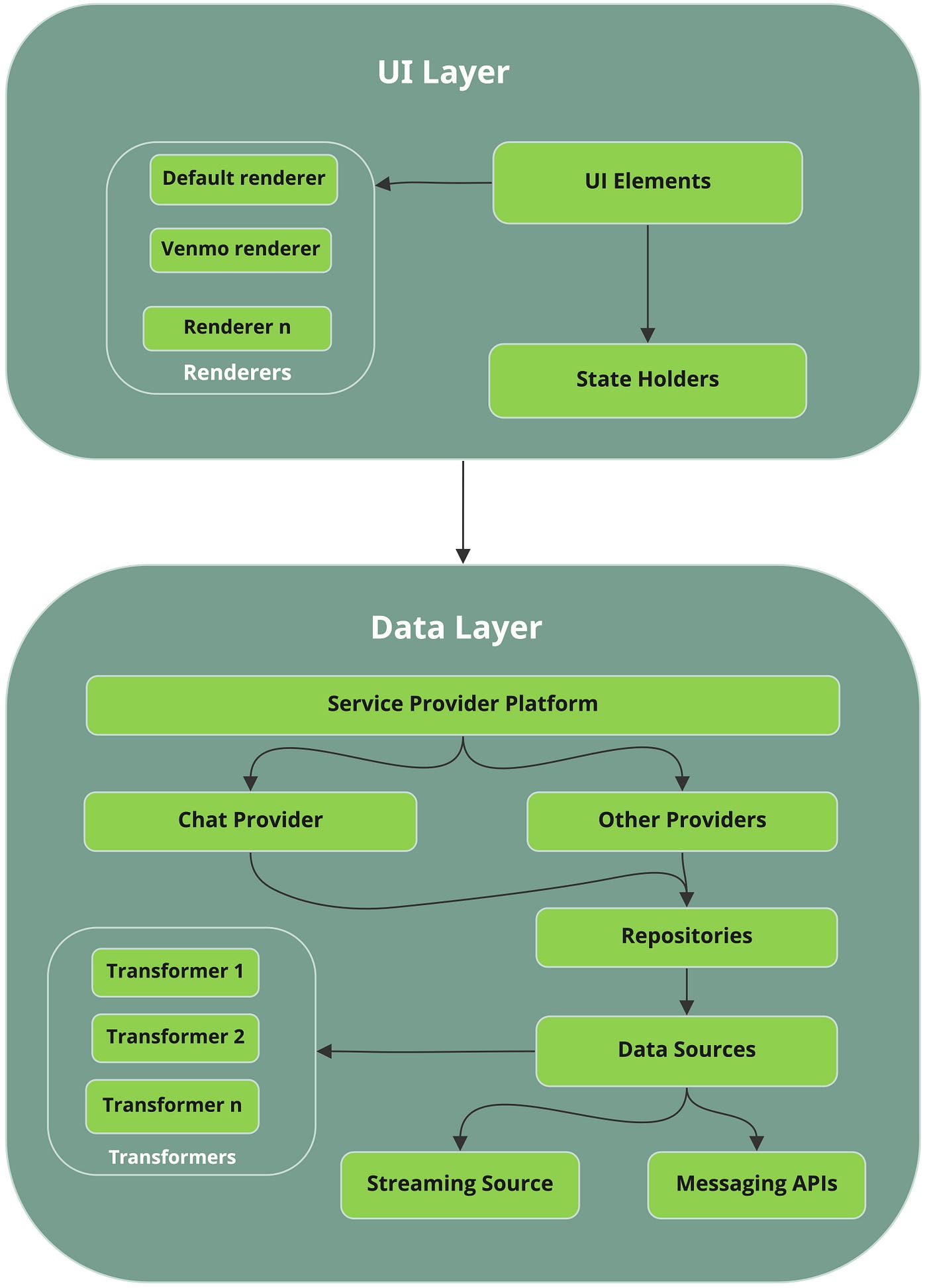
Messaging Platform SDK Architecture
SDK Structuring
Keeping things simple, clean, and organized from the beginning makes it easier to maintain them later. We started off with the SDK structuring and split them into a data SDK and a UI SDK. So now we have msg-ui and msg-data. The platform also supports other messaging use cases like emails, and these SDKs share several UI elements. So, we thought of splitting up UI SDK further into msg-commonui and msg-ui. Now we have msg-data, msg-commonui and msg-ui. This kind of structuring also made it easier to support multi-tenancy by having tenant specific SDKs like paypal-msg-ui or venmo-msg-ui with tenant specific customizations built into it.
Designing for Flexibility
We wanted the platform to be flexible enough to support customizations but at the same time keep the SDK integration process clean and simple. With this in mind, we added the right amount of abstractions to the data and UI layers to make them flexible. The core features of the platform were consolidated into a provider.
interface ChatProvider {

fun createConversation(): Conversation

fun getConversation(id: String): Conversation

fun sendMessage(id: String, message: Message)

...

}
We added options so that a provider can be injected by the platform user. There are a couple of advantages that come with this approach:
- If you want to use a different provider tomorrow, it’s easy to switch. This is crucial since PayPal has multiple tenants and each one might have different requirements.
- It’s easy to inject a Mock Provider during testing to see how well the provider works with the rest of the components in the system.
Message Streaming
An important feature in messaging is streaming messages continuously from a streaming server. There are a couple of ways to do this with different protocols, and we wanted to keep the platform open to support all of these. This was achieved by adding another layer of abstraction.
interface StreamingClient {

...

fun startStreaming(): Flow<Message>

...

}
Minimize Integration Time with Good Defaults
Though flexibility was one of the top items on our list, we did not want to sacrifice usability for it. Having good defaults is essential to bring down the integration time of a platform SDK user. After all, everyone might not want to implement and inject their own streaming client. So, we decided to provide solid defaults for all the abstractions in the platform. This gives the platform user the ability to start off immediately with the platform defaults, at the same time having the flexibility to customize anything later, if desired.
Making UI Customizable
All platform users might not customize the data layer and inject their own providers and streaming clients. But UI is one thing which most users wish to customize. PayPal has many tenants and the look and feel in the Xoom app is different from the one in Venmo. In the Messaging platform, all of that UI customization magic is made possible with the combined use of themes and our concept of a Renderer.
Renderer
The Renderer is a platform component that knows how to render each part of the UI. Be it an icon, a label, or a UI element corner radius, the Renderer knows it all and it exposes these as customizable. Any tenant can inject their own customized Renderer to change the UI look and feel.
interface Renderer {

...

val showContextualHeader: Boolean

  val contextualHeaderTitle: String


@get:DrawableRes

val contextualHeaderBackgroundDrawable: Int

...


}
Before coming up with our approach for the Renderer we considered two other options. One was a resource override where the platform will have default resources like strings and graphics so that tenants can override them. However, this approach was not ideal as it requires the resources to have the same names for the override to work. This might not always be possible as different SDKs could have different naming conventions. Even if this were not an issue, eventually this is error prone as someone accidentally changing a resource name would break the behavior.
The other option we considered was a theme-only approach. This would limit the amount of customizations we can do since themes mostly handle styles. Later, if we wanted to add another customization such as the layout of the UI elements, then this would not work. However, a combined use of themes and the Renderer can handle these requirements as the Renderer itself is a component as well, and so it can evolve to support any additional customizations in the future.
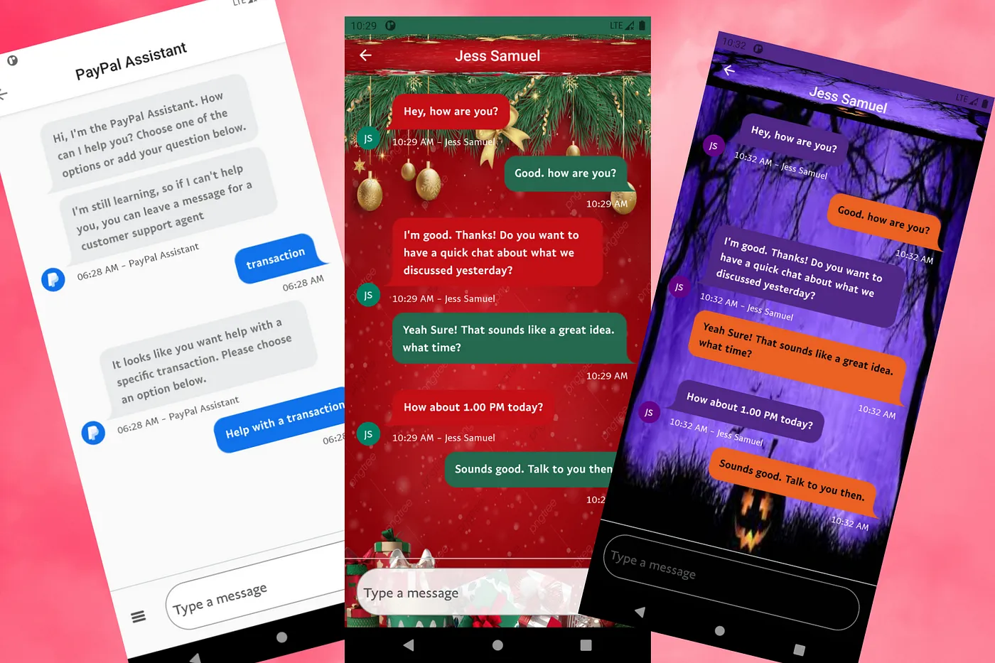
The end result is that our platform provides a default Renderer which is used in PayPal app. Similarly, a Venmo implementation of the Renderer was created and injected so that their customizations will also be compatible.

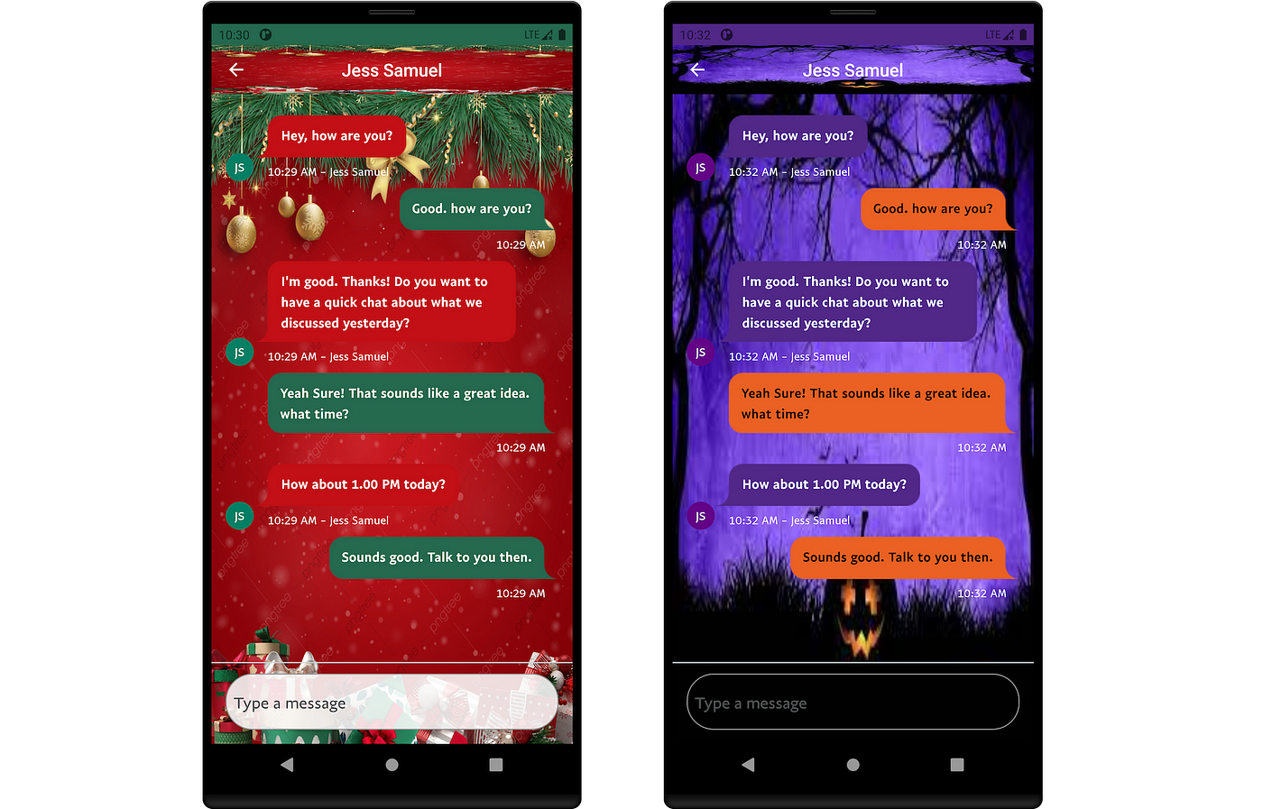
However, being customizable means that it could also look like this!
Using Flows
We make use of Kotlin flows (both hot and cold) to handle various use cases in the platform. To add a little context here, a cold flow is only triggered when there is a consumer for it whereas hot flows keep going regardless of whether it’s being consumed or not such that each new consumer receives the last element in the stream and any subsequent updates. One use case for a cold flow is message streaming which only starts when there is a consumer. We use hot flows for state and event management. The different states in our Messaging UI are handled using State flows. As a platform there are several events occurring which could be of interest to a user. These events are exposed using shared flows. Any interested observer can listen to these events and take actions based on them.
Error Logging
For a stable product, one thing that can never be ignored is the relevance of error logging. Good error logging mechanisms play a significant role in catching issues early. Platform SDKs come with support for loggers. These loggers can also be customized and injected by the platform users.
Adhering to Best Practices
It is also worth mentioning some of the general best practices and guidelines we followed:
- Feature flags to turn ON/OFF specific features in production
- Integration with internal tools to enable controlled feature ramping
- Sanity checks & static analysis integrated into the CI (Continuous Integration) pipelines to run with every PR (Pull Request), which avoids bikeshedding
- Good error handling & logging
In a Nutshell
To give a quick run-through of what we have discussed here:
- Structuring platform SDKs for better maintainability, code organization and multi-tenancy support
- Providing flexibility to platform users by making both data & UI layers customizable
- Keeping integration time minimal by providing good platform defaults
- Using the right level of abstractions in both UI & data layers so that platform defaults can be replaced by injecting custom components
- Injecting a Renderer to customize UI elements
- Good error logging mechanisms
- Following language and industry best practices
While this is not a fully exhaustive list of the things we’ve done for PayPal’s Android messaging platform, I’ve tried to include the ones that helped us the most while trying out platform SDK integrations.
Messaging Platform SDKs are currently being used by the experience teams in PayPal to build delightful messaging experiences. Inbox in PayPal app is one such example. Another one is the chat experiences that we have in both PayPal and Venmo apps. Here an app user can chat with the PayPal bot and get help for transaction/account related queries, other FAQ (Frequently Asked Questions) etc. App users can also get this chat transferred seamlessly to a customer service agent for additional help.
Recommended
Managing Recurring Payments with Apple Pay Using PayPal
4 min read

Why You Should Attend PayPal’s Developer Meetup at Money20/20
4 min read
